|

by Linda Lee
www.askmepc-webdesign.com
1. Design and overall appeal. Use a clear and simple
design.
- Is it representing you and your company in look and overall appeal?
- Do you feel your site reflects what you are trying to achieve?
- Simple is better. White space is better.
- Keep in mind how people read a web
page.
- Layout matters.
F-Shaped Pattern for Reading Web Content: this
article discusses eyetracking visualizations
showing that users often read Web pages in an F-shaped pattern:two horizontal stripes followed
by a vertical stripe.
2. Content- Information of value.
The reality is content is what brings the reader to your site.
Information, good solid information. There is no cheating on this one. You should feature helpful
information that fills a need.
Have it proofread or hire a copywriter. Always spell check and check your links. Keep your
information current and updated.
3. Keywords- Title keywords and repeating keywords.
Keywords are the words or phrases people will find you with.
The rule of thumb is use your keyword phrase or word in your title and then repeat it 2-3 times in
your article.
Understanding keywords is a huge business and can be overwhelming. A great resource for further
study is
this website callled SEOBOOK. He also offers lots of free
courses and resources on how to SEO your site.
If you are feeling like you need help coming up with new keywords, Google has this free keyword tool.
4. Ease of use- Navigation. Make navigation easy.
A vertical web site navigation system
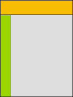
The image on the left shows a very common layout of web sites.
The header section (in orange) carries the logo, ideally on the left,
and might have other images and/or text.
The navigation menu is placed in the green section.
It might not span the entire height of the page and can have other web page elements
or simply blank space below it.
The main web page contents (text and images) are situated in the light grey area.
Horizontal web site navigation bar
 The web site navigation bar can also be placed horizontally right below the header
section The web site navigation bar can also be placed horizontally right below the header
section
of a web page as depicted in green
color in the adjacent image.
The main contents of the web page are located in the light grey area.
The only disadvantage of this web page layout is that the text spans the entire width of the page.
This makes it difficult to read as studies have shown that online surfers find it hard to read web
page text which spans more than 600 pixels. This problem can easily be overcome by limiting the
width of the text display area so that it's lesser than 600 pixels. To fill the blank space created
on the left and the right of the text, one can use images or other design
elements.
Vertical and Horizontal navigation systems
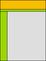 The third common web site navigation menu layout is shown in the adjacent
image. The third common web site navigation menu layout is shown in the adjacent
image.
Here the navigation
system exists both as a horizontal bar right below the header and also on
the left.
This is generally used for sites (such as this one), in which there are several pages (and hence,
several links).
For example, on webdevelopersnotes.com, links to the important sectionsof the web site
are
placed horizontally and the links to pages inside that sectionare placed on the left.
Links placed in the horizontal bar remain the same throughout the web site but the links on the
left change depending on the web site section.images that load in the Navigation
Information from Web Developer
Notes.
5. Browser Compatibility- Test what your site looks like in a multitude of
different browsers.
Try Microsoft Internet Explorer, Mozilla Firefox, Opera, and Safari, etc.
You can use this tool, http://browsershots.org to check
what your site looks like in various browsers.
6. ALT Tag Optimization - An Important
SEO Component.
In Google’s webmaster guidelines, they advise the use of alternative text for the images on your
web site:
Images:. Use the alt attribute to
provide descriptive text. In addition,
we recommend using a human-readable caption and descriptive text around the
image.
Alt tags are what you use when you insert a graphic and you fill in the description.
This is what people see when their browser hovers over your image, and if someone has images
disabled, they will only see
what you wrote for your alt tag. Search engines also pick up this text.This is a great opportunity
to once again reinforce your
topic and utilize your images further in the search engines.
7. Keep your site updated.
Spend the time you need to check your website
out.
Run a weekly check of all your links and look at your website to make sure everything is
working.
Keep your product pages updated.
Keep your contact information updated.
Add a widget that displays the current date so your site looks fresh. ( We do this for clients.)
Most people will never alert you to the fact that things are broken on your site.
These things happen. Other websites move pages, or go out of business.
8. 404 redirect page.
Most hosting has a section in their C-panel, Plesk or
Vdeck that will allow you to insert a 404 error page redirect code.
That way if anything is not working on your site, or you may of changed or moved your own pages,
the visitor will not be
greeted with one of those 404 error pages, but redirected to a page of your choice.
Click here to see how to set
one of these up. We offer this service to our clients.
9. Readable text. You need to select a font that the majority of web users
already have installed on their computer.
This is a real bone of contention for webdesigners and there are ways to get around it with CSS
stacking and codes,
but at the end of the day most people will select a common font and get on with it.
If you use a font that a reader does not have, many times your page will display poorly and even be
unreadable.
See list of safe fonts here.
10. Offer value.
Whatever you niche is, whatever your topic, offer your readers value.
Value in information, value in product. Offer resources and links that will help your reader.
11. Give them a reason to return.
I suggest adding a blog or a
forum to your website.
These are more interactive and people can ask questions and leave comments.
The search engines love forums and blogs and they will definitelyincrease your ranking in the search engines.
You also can continue to update and add more content and products to your site.
Start a newsletter so you can capture emails and discover who is interested in what you do.
5 Ways To Lose
Customers with your Website Design
- Flash elements and flash "splash" pages that take too long to long to load
or offer nothing of value.
Everyone cannot view your page with flash. Various people have their browsers set to block pop
ups and
that may include flash files. Flash also takes time to load and the average time a user will
wait to see your site is,
4 seconds.
Here is a sample of what a flash website will display like when browsers
are blocking flash.
Site with blocked flash
Site as it
looks with flash displayed.
- Walking, talking images of a person that start talking as soon as a
visitor opens the web page, like this.
Most people do not like this. Do you?
- Sound. Most user do not like automatically generated music or sounds on a
website.
People find this annoying and distracting.
Have a player control, so they can turn it on or off if they are interested.
See a great example of a very bad website here.
- Pop up ads. Most people use pop up blocker now, so why upset your
user?
I am not even going to show an example of this. We all know what this looks like!
- Huge images that take forever to load.
Fact: The average time a user will wait for a page to load before leaving is 4
seconds. Try it.
Bonus Tips
From AskMePc-WebDesign
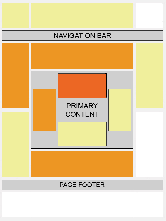
Where should I place ads
on my pages?
This is from Google, but it applies to any ads you want to
feature.
The best location for Google ads varies from page to page, depending on
content. Here are a few questions to ask yourself when considering where to
position your ads:
- What is the user trying to accomplish by visiting my site?
- What do they do when viewing a particular page?
- Where is their attention likely to be focused?
- How can I integrate ads into this area without getting in the users'
way?
- How can I keep the page looking clean, uncluttered and inviting?
|
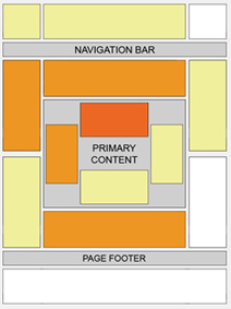 |
Certain locations tend to be more successful than others. This "heat map"
illustrates the ideal placing on a sample page layout. The colors fade from
dark orange (strongest performance) to light yellow (weakest performance). All
other things being equal, ads located above the fold tend to perform better
than those below the fold. Ads placed near rich content and navigational aids
usually do well because users are focused on those areas of a page.
While this heat map is useful as a positioning guideline, we strongly
recommend putting your users first when deciding on ad location. Think about
their behavior on different pages, and what will be most useful and visible to
them. You'll find that the most optimal ad position isn't always what you
expect on certain pages.
For example, on pages where users are typically focused on reading an
article, ads placed directly below the end of the editorial content tend to
perform very well. It's almost as if users finish reading and ask themselves,
"What can I do next?" Precisely targeted ads can answer that question for
them.
Tip for forum webmasters and bloggers: Check out our specific tips on ad
placement for forum
sites and blogs.
|
Affordable Custom Websites & Blogs
|